newcolorbar documentation
The newcolorbar function creates a new set of invisible axes matching the size and extents of the current axes. This allows a second colormap to be used in such a way that it is perceived to be two separate colormaps and two colorbars in the same axes.
Contents
Syntax
colorbar
colorbar(Location)
colorbar(...,PropertyName,PropertyValue)
[cb2,ax2,ax1] = colorbar(...)
Description
colorbar creates a new set of axes and a new colorbar in the default (right) location.
colorbar(Location) specifies location of the new colorbar as 'North' inside plot box near top 'South' inside bottom 'East' inside right 'West' inside left 'NorthOutside' outside plot box near top 'SouthOutside' outside bottom 'EastOutside' outside right (default) 'WestOutside' outside left
colorbar(...,PropertyName,PropertyValue) specifies additional name/value pairs for colorbar.
[cb2,ax2,ax1] = colorbar(...) returns handles of the new colorbar cb2, the new axes ax2, and the previous current axes ax1.
Example 1
Let's plot some parula-colored scattered data atop a grayscale gridded dataset. Start by plotting the gridded data. We'll use the inbuilt peaks dataset for this example:
pcolor(peaks(500))
shading interp
colormap(gca,gray(256))
colorbar('southoutside')

The newcolorbar function differs from Matlab's colorbar function in that we have to create a newcolorbar before plotting the new color-scaled dataset. We can create a new colorbar quite simply:
newcolorbar

Then plot some random color-scaled scattered data: Plot a scattered dataset with parula colormap:
scatter(500*rand(30,1),500*rand(30,1),60,100*rand(30,1),'filled')

Example 2
Now let's repeat Example 1, but add a little formatting. I'm using Stephen Cobeldick's brewermap function to create the lovely colormaps:
figure
pcolor(peaks(500))
shading interp
colormap(gca,brewermap(256,'greens'))
cb1 = colorbar('southoutside');
xlabel(cb1,'colorbar for peaks data')

Add a new colorbar toward the bottom inside of the current axes and specify blue text:
cb2 = newcolorbar('south','color','blue');

Plot scattered data and label the new colorbar:
scatter(500*rand(30,1),500*rand(30,1),100,8*randn(30,1),'filled')
colormap(gca,brewermap(256,'*RdBu'))
caxis([-10 10]) % sets scattered colorbar axis
xlabel(cb2,'colorbar for scattered data','color','blue')

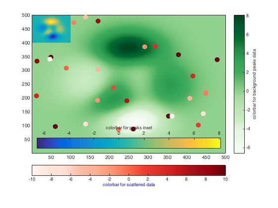
Example 3: Three colorbars
Here's an example of three colorbars:
figure
pcolor(peaks(500))
shading interp
colormap(gca,brewermap(256,'greens'))
cb1 = colorbar;
ylabel(cb1,'colorbar for background peaks data')

cb2 = newcolorbar('southoutside') ;
scatter(500*rand(30,1),500*rand(30,1),100,8*randn(30,1),'filled')
colormap(gca,brewermap(256,'reds'))
caxis([-10 10]) % sets scattered colorbar axis
xlabel(cb2,'colorbar for scattered data','color','blue')

cb3 = newcolorbar('south');
pcolor(1:100,401:500,peaks(100))
shading interp
xlabel(cb3,'colorbar for peaks inset')
Author Info
The newcolorbar function was written by Chad A. Greene of the University of Texas at Austin's Institute for Geophysics (UTIG), August 2015.